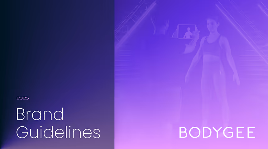
This guide provides the essential assets and guidelines to help you build and maintain the Bodygee visual identity.
To gain access to a more comprehensive analysis of brand elements and their applications, consider downloading the digital version.

00 Intro
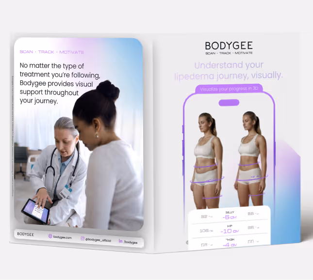
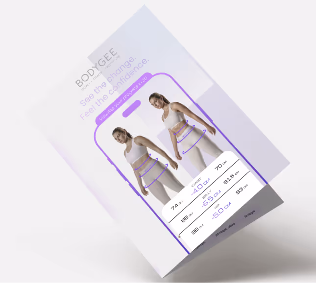
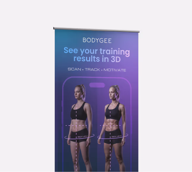
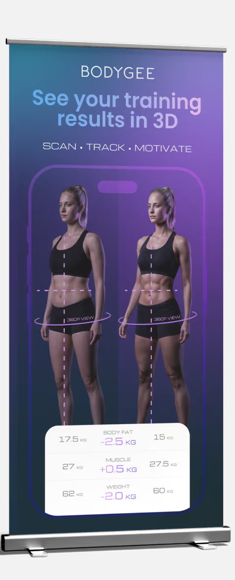
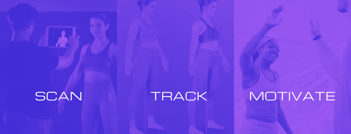
Bodygee uses two distinct visual identities tailored to our primary audiences: Fitness and Health.
FITNESS

01 Logos
The Bodygee logo is available in two versions: Horizontal (primary) for most use cases, and Square for limited spaces or profile avatars.
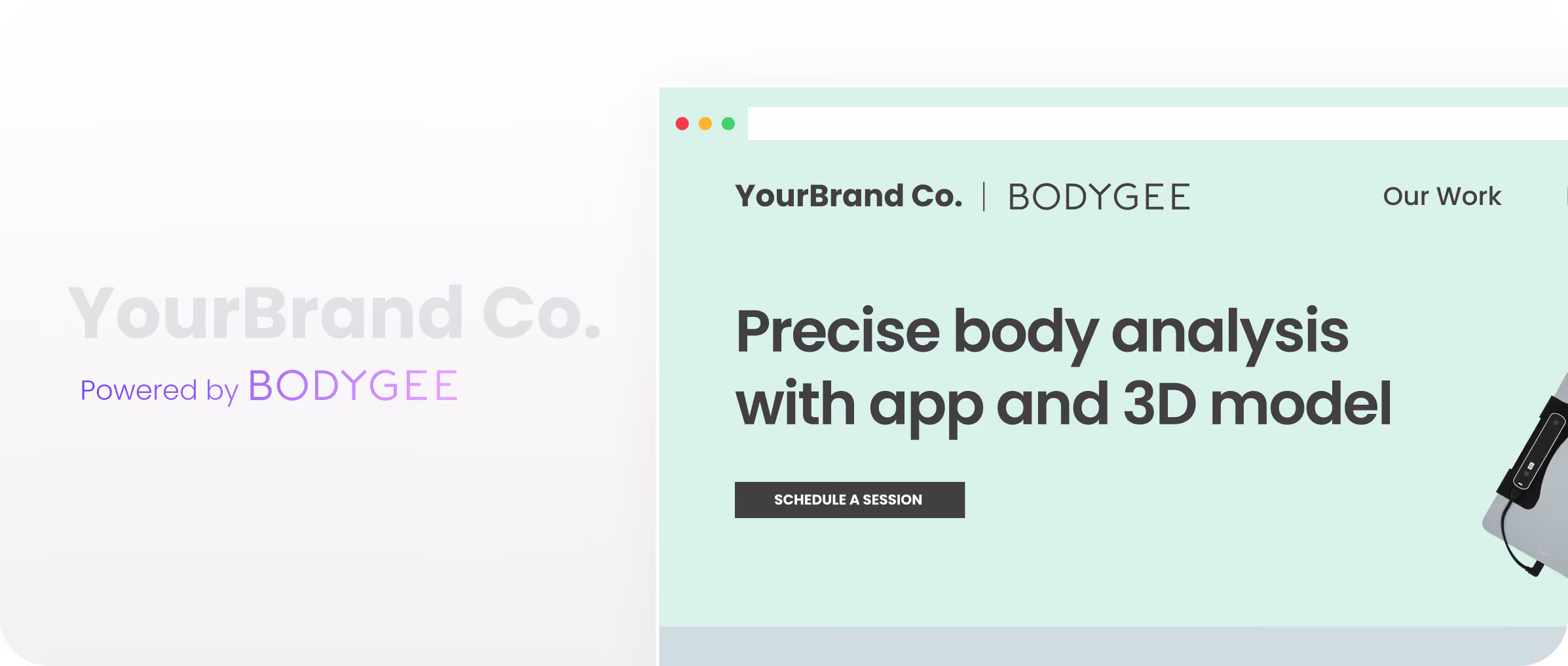
Bodygee logos can also appear more discreetly, alongside partner brand logos, reinforcing the quality of the service offered. They can appear in three different ways:
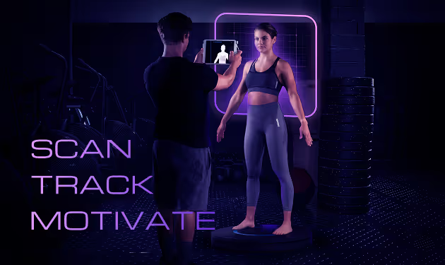
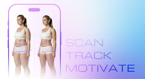
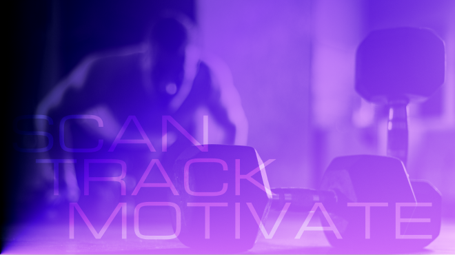
02 Taglines
Through stylized typography, our tagline has evolved from a concept into a versatile visual asset.
03 Icons
The iconography follows the same rounded shapes applied in the brand's concepts and also introduces a new twist with gradients, aiming to create a unique aesthetic even for the most regular content.
04 Typography

We recommend using this font in ALL CAPS for maximum impact.


05Colours


06Backdrops
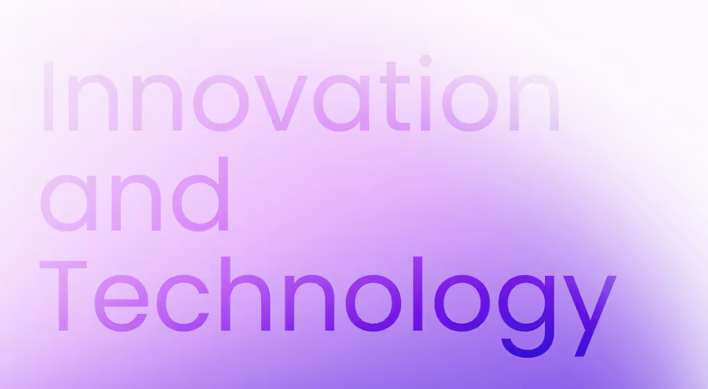
Combine solid backgrounds with oversized, blurred gradients to create depth and brand consistency.


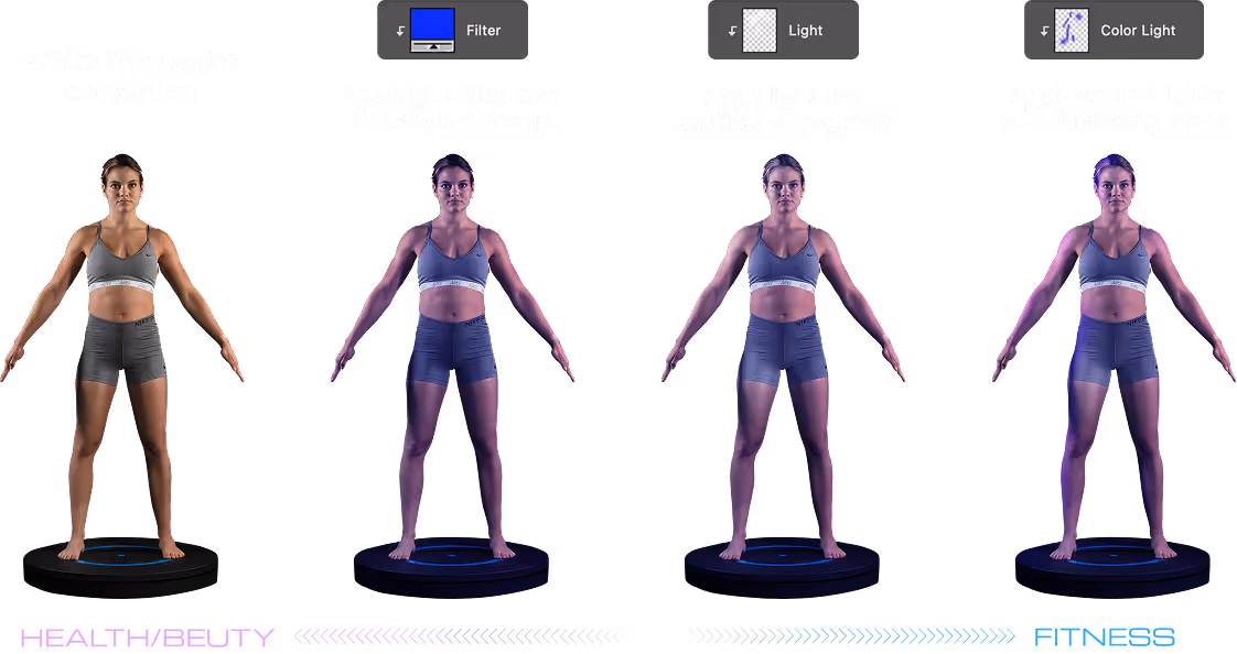
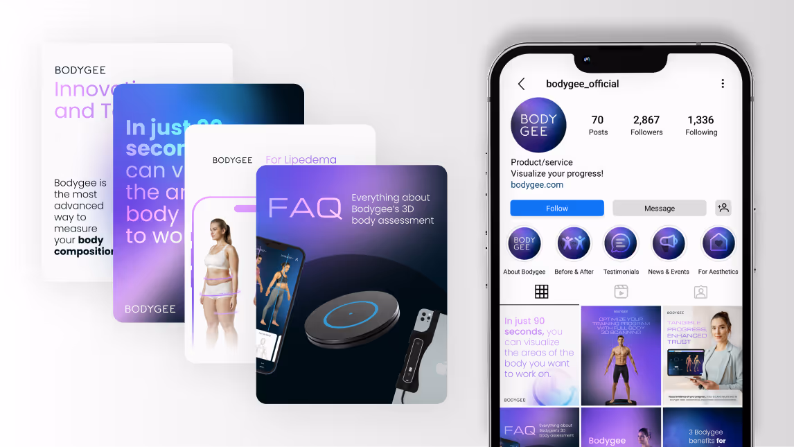
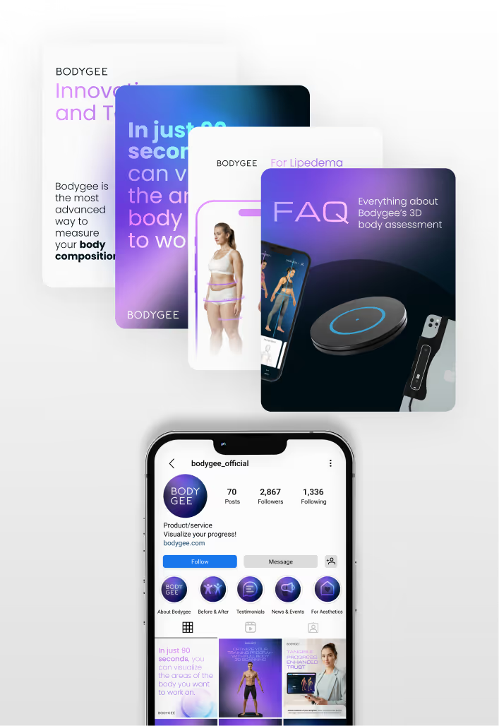
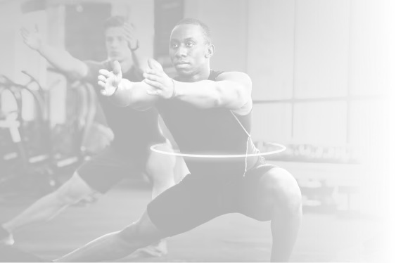
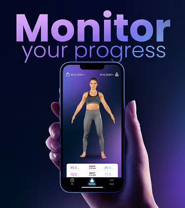
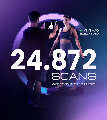
07Images
The image processing also utilizes the brand's color dichotomy, creating two distinct styles that should be applied according to the theme used in the communication.